MAKING OF - DOTA 2 FAN VIDEO / EMILY KALDWIN
My favorite shot of my quick personal project, fan video for DOTA 2 - The International 2021, responsible for all aspects.
Hello again ! It has been a while since I am sharing the process of my personal project, This project has been awesome and experimental for me, playing around with normals, hopefully this will be anything useful or you guys find it neat !
This project is heavily inspired by “RISE” League of Legends video, made by Fortiche Production.
01 - PREPARATION
I have been pretty inspired by stylized project, starting off the bat from Spiderman : Into the Spiderverse, The Witness, “RISE” music video, and I remember the moment I saw the trailer for Arcane , I was like “Gosh, this looks sick, its like watching a moving concept art !”. With some of the experience of trying to make something stylized at work, I decided to create a look heavily inspired by “RISE” music video, or just Fortiche’s style for creating League of Legends short, with some goals.
GOALS
Here are some of the goals, that I hope to achieve:
Creating the stylized look with as less baked in lighting information as possible. I have been seeing a lot of stylized work that looks super awesome, but the sad thing is, the whole lighting information is baked, even some with literally just a baked in lighting on diffuse color (no shading information/ light response at all).
Take note for the in-the-future short film work, I always been wanted to make a short film with a small team of people that I know, so this is another chance for me to test out if my pipeline would work.
REFERENCES
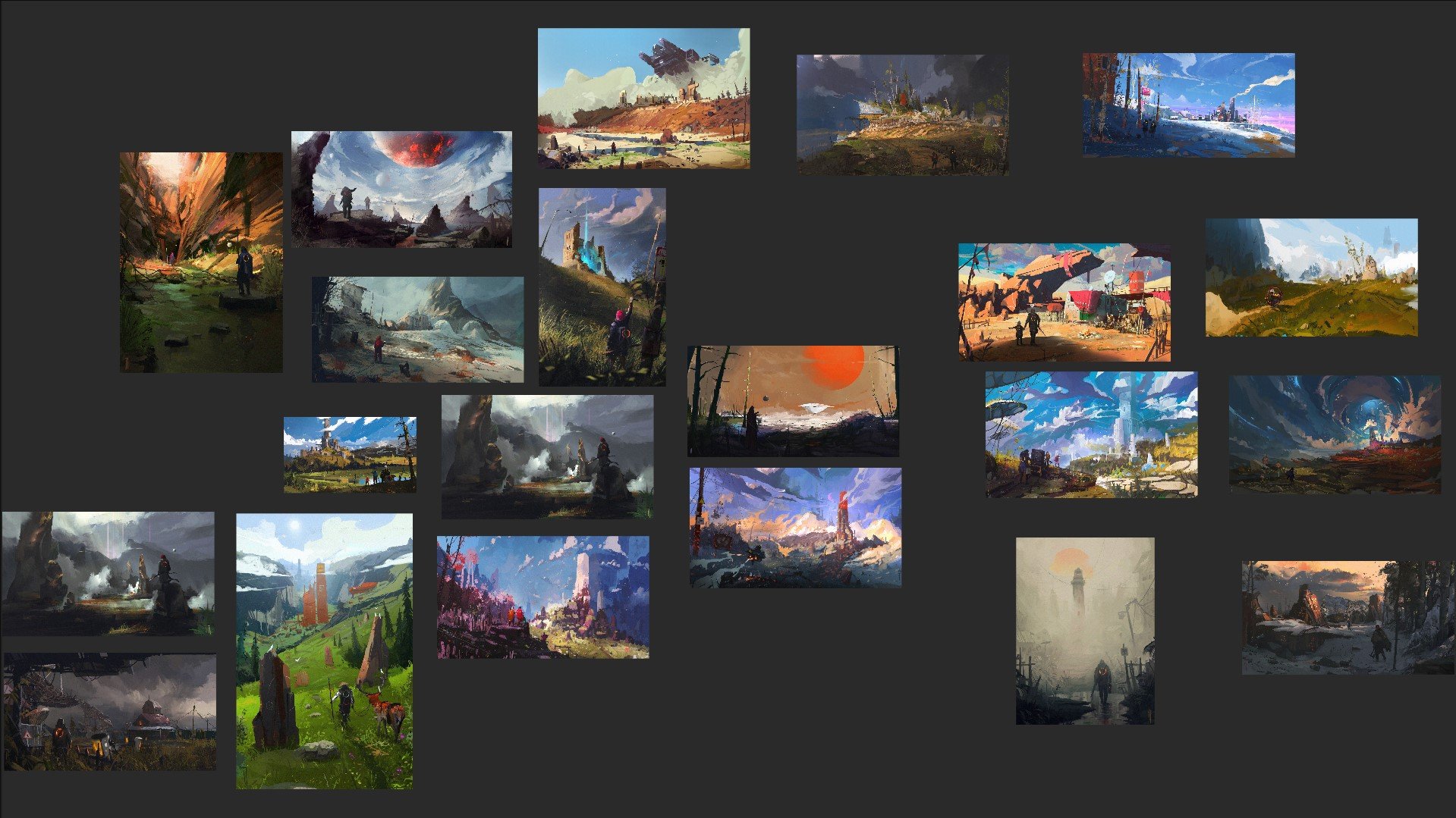
Here are some references that I gather in pureref (it is a pretty good tool for gathering references ! really recommend it !):


02 - TESTING - EMILY KALDWIN TEST
Of course with stylized project, I needed to do some small test, just to see on how far I can go to get the result as close as possible to the style. I borrowed a project from my dear friend Manuel Armonio, since he was really into this sort of stylized work as well, and I managed to get the model of his Emily Kaldwin personal project.
Turntable of the Emily Kaldwin test, really love this one !
So this is my opportunity to try out my ‘theory’ of creating a stylized look while keeping it reactive to the light : NORMALS ! GOTTA PAINT THE NORMALS ! Inspired by the ”GDC presentation - The Art Direction Of Street Fighter V” (Thank you to Patrick C N Wong, for showing me these neat GDC stuff !, check out this one for Guilty Gear also to create a nice cell shaded look ! )
Based on this treatment, there is a question “How do I do this ?”. So I managed to create some substance designer generator to create a brush strokes, unfortunately, it does not work well with characters. It just looks too much of a procedural, as you can see in this RISE character concept, the brush stroke in the face was intentional, in both direction,size, so trying to do a Tile Sampler of brush strokes in designer won’t do its justice.
So I decided to go crazy and just “Lets try to paint World Space Normals, then convert it back to normal to be used.”

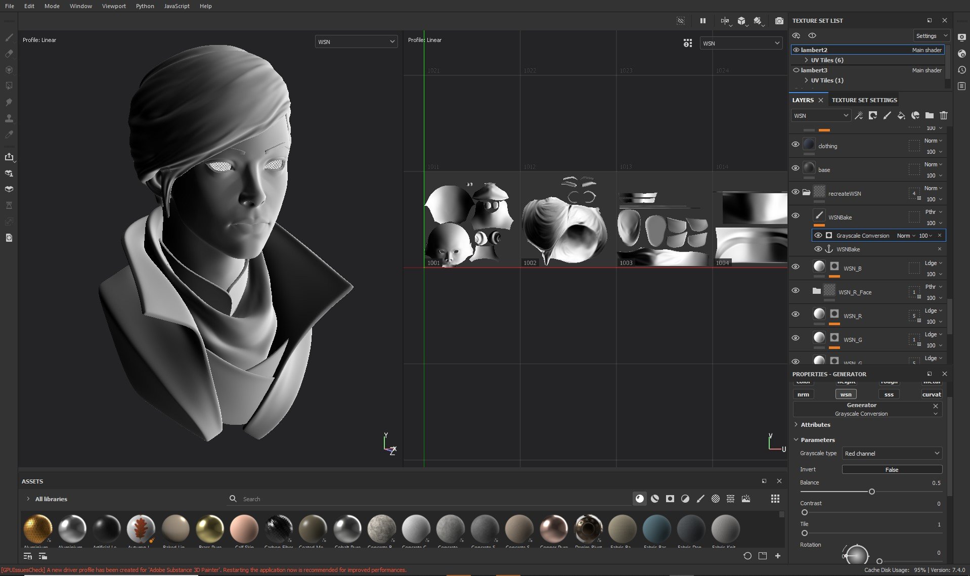

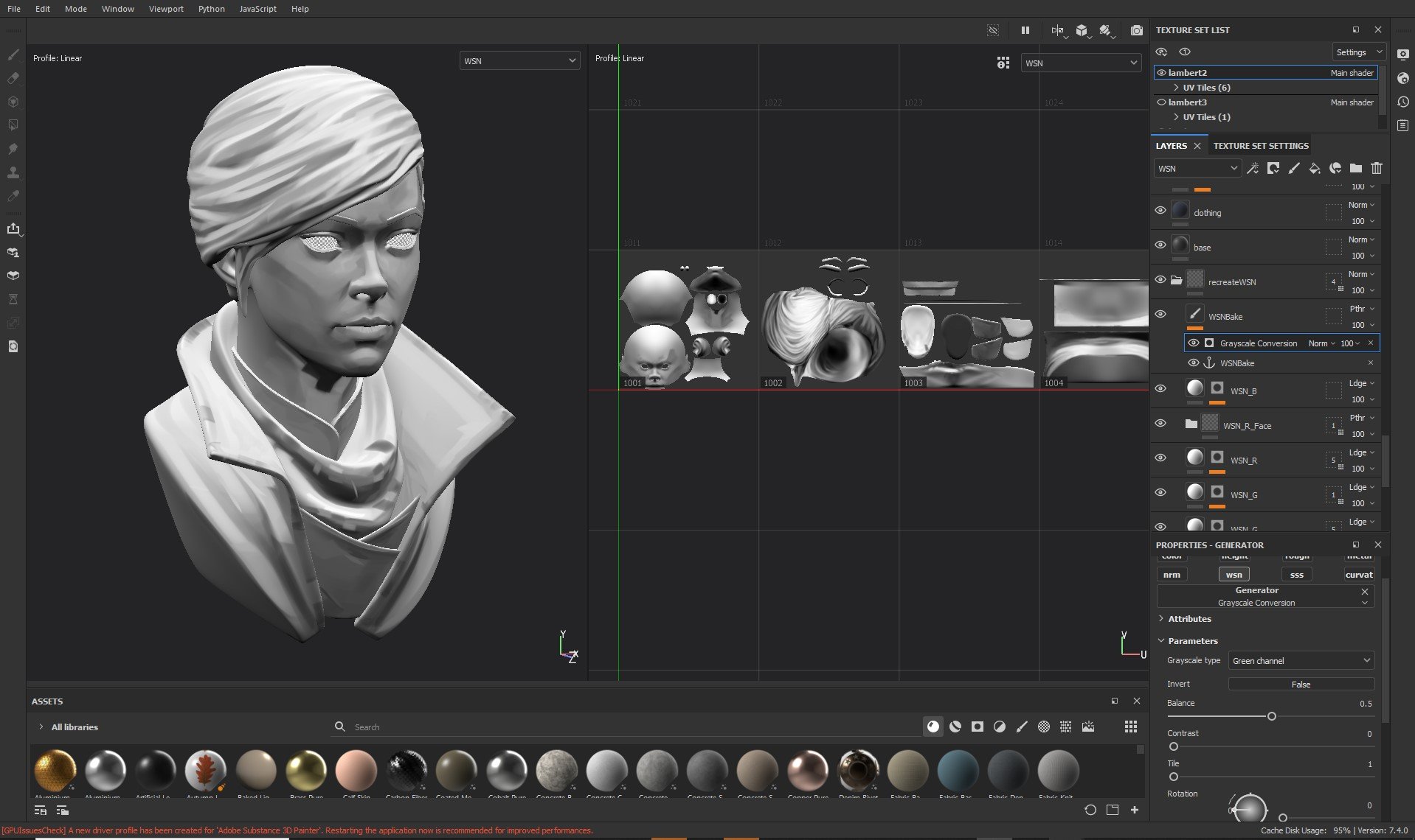


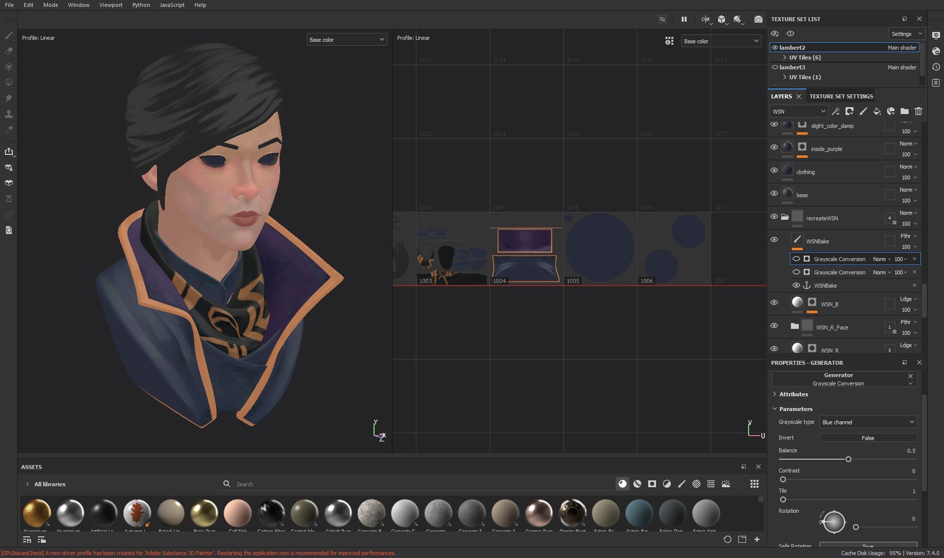
Breaking away WSN into R G B channels and remerging it back has some advantages, but unfortunately still have some disadvantages which is:
+ Way more artist friendly, I tried to do a straight paintover the object’s world space normal, the result was pretty bad, due to the value of R G B needed to be still somewhat technically correct.
+ By doing this, basically you are painting the model in : light on the left/right side of the head(R), light on top over head (G), light on the front of the head(B)
- You need to paint 3 times (R, G, B)
- This may be up to the style you are trying to achieve for, but there is a tendency of some brush overlaps between channels, which may create unpleasant result.
- I find painting the R and B channel can get pretty confusing still.
*To be fair, on this one I spent 75% of my time on the G channel, and not a lot on the R and B , since I find it tricky to paint those out, since also I dont want to create those overlaps.
Here is the side by side comparison for the painted normals, and original normals:


03 - DOTA2 Fan Video - ENVIRONMENT
Another thing that I wanted to do in this project is making sure to get all of my environment getting that painterly feel while keeping it reactive to the light also. But at the same time, I wanted to start it simple, so I decided to create this assets based on the ref of my scrapped projects : grass, snowy grounds, rock with snow ( I ended up not doing the banner in the end due to the time constrain).
Grass
As for the grass, unfortunately I am missing some of the turnaround test that I did (my harddisk got pretty full due to the testing….). So down here is some of the test that I’ve done, trying to get the variation to the concept I am trying to achieve.
I ended up going for the Grass vary v3, and as for the setup, shown below with some explanation


Cliff
As for the cliff, I ended up using a procedural brush stroke, and some utility tools for it that I created in designer,to be used in painter because I find i need the interactivity of it.
Ground / Snowy Ground
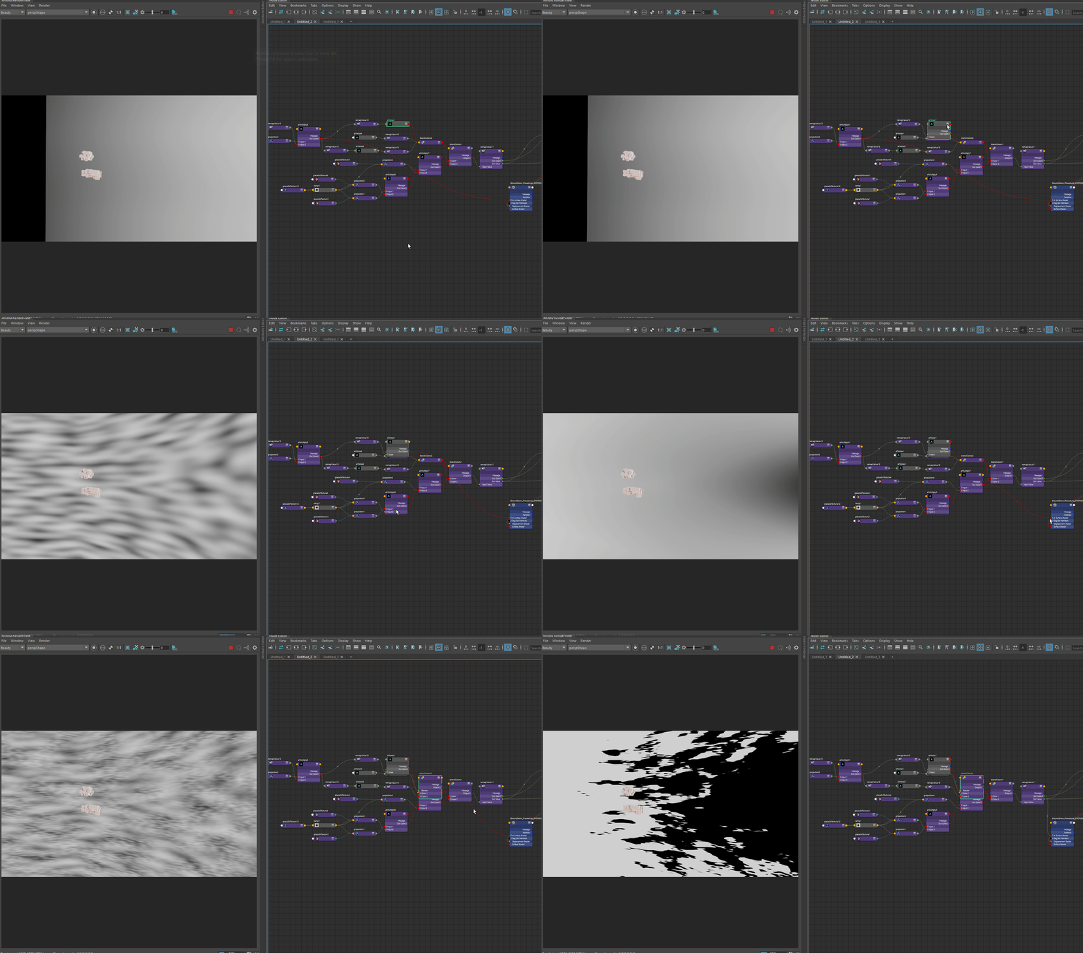
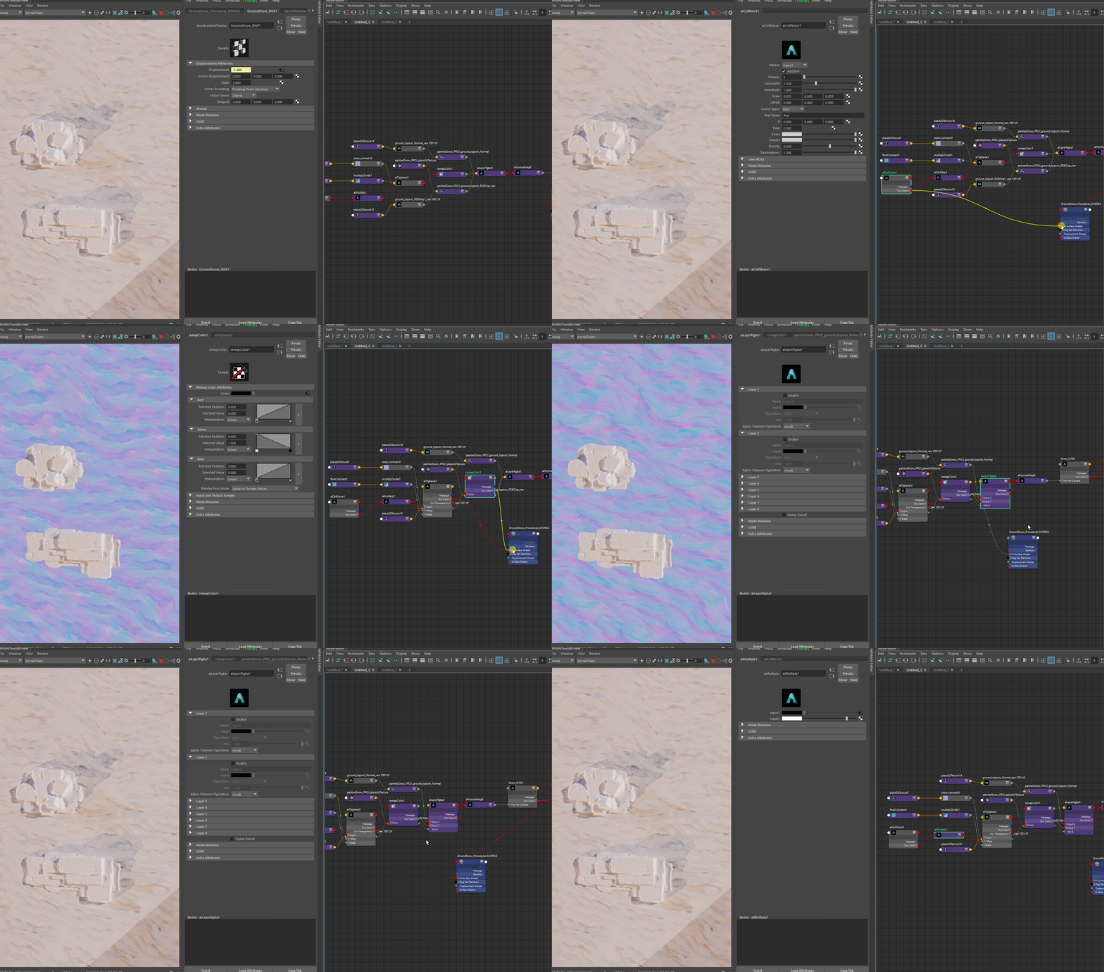
As for the ground, I am not trying to do any far away shot, and the ground should be in a quite grazing angle so hopefully some tiling look would be not as noticeable in the end, even though atleast I want to give it a bit of warp here and there to give it a bit more flow.


04 - DOTA2 Fan Video - CHARACTER
As for the character, I am trying to find a way to model efficiently, I ended up going by using one of the base human model by Olivier Couston , I find his model to have all of the stylization needed, and if I want to do some tweaking it tends to be to tone down how muscular my character was, and then do tweaks on the face until I get the desired look for the character that is based on the actual DOTA 2 professional player, Topson. As for the armory, I ended up getting the in game model, then do a hi-res stylized sculpt pass to it.
Right is the finished product and the others are process/ reference of the character, I initially wanted to go for the invoker look but decided to change it to monkey king.
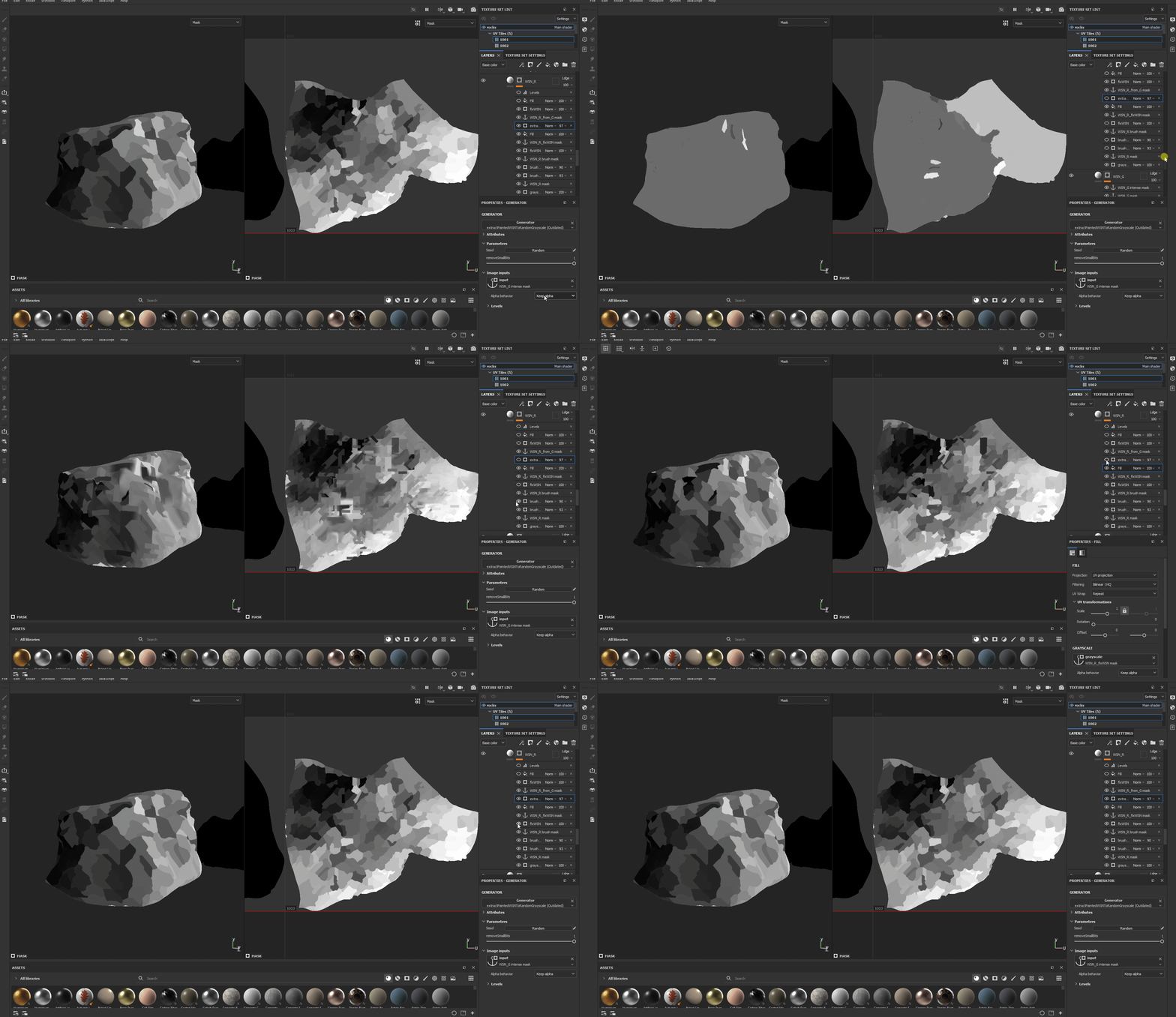
As for the texturing process, I did pretty much similar thing that I did on Emily Kaldwin, but I added some addition where I some sort of borrow the green channel’s brush stroke (by doing divide to the WSN.G), then run it through my fixWSN utility to resample each stroke to use the color of the WSN.R channel instead, I ended up adding some bits of worley noise because as you can see there it is not perfect, but I find it help to like make the shading more graphic that way (since trying to repaint the R channel will be resulting in a double stroke overlaying on top of each other.)
final texture & lookdev for this character. (beauty render)
05 - DOTA2 Fan Video - ASSEMBLY
As for the assembly, All of the assets I have for this project already have the possibility for it to be reused since I can’t do a refined assets for each pieces (since it was quite a short-term project), I made a bunch of rock variations based on the rocks that I have, I scattered the grass & small rocks to the ground to give it a variation using MASH to scatter the aiStandin that I’ve prepared to optimize the performance. And I find the plus of this setup is I can tweak the location of grasses/re randomize it later for the sake of the shot.


06 - DOTA2 Fan Video - LIGHT/COMP
As for the lighting/comp, the setup ended up pretty simple, For the lighting I am using the lightrig I have, and tweak it per shot, I made sure in the main scene that I have the required render pass, and as for the render layers I separated it into char and env, with every render layer has the other aspects rendered as a matte.
*I find with the recent arnold update, the diffuse_albedo seems to consider also the normal of the object, so i turned off the normal in the diffuse color render layer that I rendered separately.
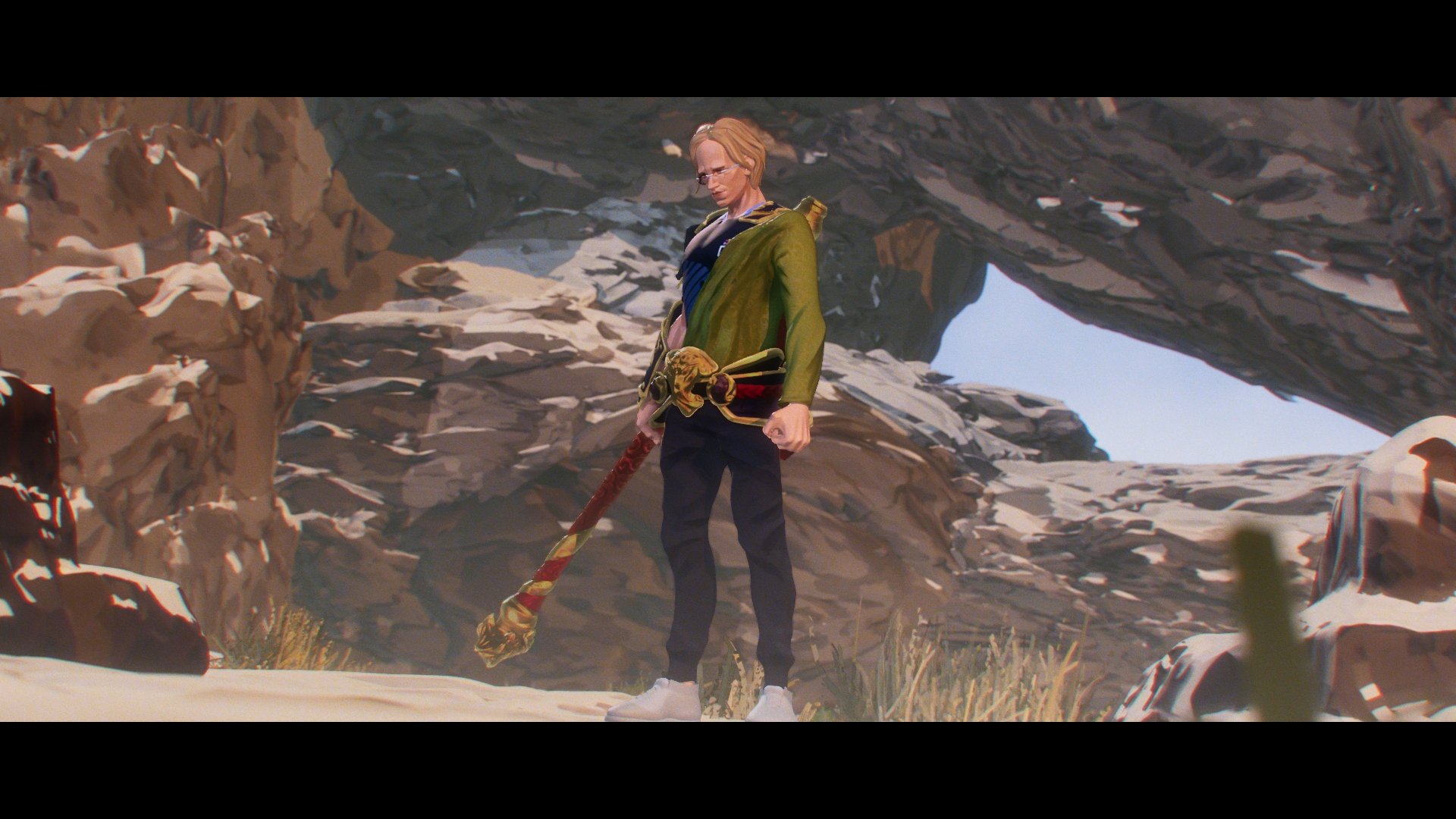
For the comp, it was more like balancing a pure diffuse map (basically your flat, exported diffuseColor) pass, to your beauty render, added gradation from below, anamorphic bars, chromatic aberration


07 - CONCLUSION
This project was a fun one for sure, lots of tests and knowledge that I got from work trying to do a stylized work being put into this personal work, it was fun playing with normals ! hahah. Knowing that, I find:
I find especially in environment, it is pretty hard to get a 3D that looks out of the bat looking like concept, there is just one of those intentional stylization or strokes that is missing, especially trying to do a super far away (like giant cliff) seems like could be done better if it was done as a matte painting instead.
I find it is probably better to try to do a painted metallic look rather than trying this method of painterly normal/ metalness sort of thing, I find there is some 3D feeling into it somehow even though I have tried to push the painted normal as far as possible(or I would say the look is not as pleasing as if it is painted). Also yes, knowing that there is an issue where it doesn’t react dynamically PBR-wise but I believe it is still better than doing this introducing metallic method. (probably could be done by just using specular to introduce some dynamic specular instead.)
I had some fun chat over Artstation with Roger Magrini discussing about this whole fortiche/arcane look, and he showed me this work which requires some ‘simplified normals’ embedded in the geo where I find it interesting. Would it be the missing piece to push the stylized look even further ? Maybe !
* So, my painted normal in the end seemed to be still taking the normal of the object into consideration still, so not fully tweaking it 100%, it was more like : object normal + any normal map input I believe, so doing that may help to omit all of the smooth normals that is still inside the actual geo itself.


